Calibrate CSS
March 15, 2021 by Lasse Fister • GitHub @graphicore • contact
Contents
An important but often overlooked property of the CSS-unit system is that, on screens, its absolute length units don’t describe what their names imply they do. The reasons are historical, and the current status quo allows authors to design without thinking about the deeper nature of their target devices, like size and viewer distance—which is a good thing. However, the consequences are that a CSS-Pixel is likely not a hardware pixel on the display, and that a CSS-Inch is likely not a real-world physical Inch. Regarding the latter, two categories of use cases are made infeasible or hard to implement:
- measuring or proofing
- accurate design, especially for fixed media
This article is about enabling CSS-authors to work with real-world physical measurements, and to make it easier to do so.
“A robust and minimal calibration scheme”
This is a demo of a simple widget that lets you, the user, calibrate your screen so that it can confidently display real-world distance units. Calibration is a big word; I hope the widget demonstrates sufficiently that it is quickly done and not a big deal.
If the widget was used correctly, we can now use real-world sizes:
One real centimeter: One real inch:
The result is set to a custom property in CSS on :root as --unit-scale-physical its value
is .
The example expects square pixels. Generally, it is possible to calibrate width and height separately. However, on the web, reasonable square pixels can be expected—and if they aren’t square, it should be tackled on a different layer, e.g. OS or device driver.
The calibration widget was inspired by my own experiment and an #614 issue comment (now also CSS-WG FAQ) where @tabatkins describes a calibration page workaround:
Notably, this would basically be:
- Have a calibration page, where you ask the user to measure the distance between two lines that are some CSS distance apart (say,
10cm), and input the value they get.- Use this to find the scaling factor necessary for that screen (CSS length divided by user-provided length), and store it locally (via localStorage, or a cookie, etc).
- On the pages where you need the accurate length, fetch it from local storage, and set a
--unit-scale: 1.07;(subbing in the real value) property on thehtmlelement.- Anywhere you use a length that needs to be accurate, instead of
width: 5cm;, writewidth: calc(5cm * var(--unit-scale, 1));.This is a robust and minimal calibration scheme that will “fail open” - if the user hasn’t calibrated, or clears local data, or has JS turned off, it’ll just use standard CSS units (due to the , 1 default arg for the unit scale), rather than breaking.
About this Document
This article is answering a “work order” in the form of a comment by @frivoal on w3c/csswg-drafts#614 , a discussion on the Topic “[css-values] Ability to address actual physical size #614”:
[…] It is possible that most members of the CSSWG and most browser engineers are wrong, that there’s a big flaw in the collective reasoning, and that one way or another, this is actually a good idea. If you think so, start by understanding the arguments against, then build a strong case debunking them, and explain why you’re right.
Merely stating that there’s no downside isn’t going to be convincing.
In the meantime, there’s also an entry in the CSS-WG FAQ, describing the history and status of the topic and a new issue #5986 [css-env] Device Pixel Ratio trying to move the discussion forward.
Disclosure
As of beginning this, I don’t know if a good case can be built, but I’m instinctively biased towards having the ability to use real-world physical sizes in CSS. I found out about the bigger discussion right after collecting my observations in Real World Absolute Length Units Evaluation.
Contribute
Please visit and follow issue #614 [css-values] Ability to address actual physical size as it is the place to discuss the general topic.
Help to realize Browser Support Roadmap: Level 0!
I understand this as an open document, meaning that contributions are welcome via the GitHub issue tracker and discussions board and Pull Requests on the actual document and on the calibration widget.
This openness also means it’s possible, even likely, that the article
changes over time. The change history can be examined via git, but when
quoting, it may still be a good idea to keep the current git commit hash
of the repository HEAD commit:
aace1685d9.
There’s a Changelog at the end of this document.
Debate
Critique of the CSS-Reference-Pixel
Examples, where the CSS-Reference-Pixel model solves issues, that seem to be harder to tackle in the physical-measurements model, are often used as counterpoints to having access to physical measurements in CSS at all. This kind of argumentation should be considered bad style, rather than disputing that, I’m going to explain where I see the shortcomings of the CSS-Reference-Pixel. I hope this will show why a complementary model with some sort of access to physical measurements is necessary. I do believe the CSS-Reference-Pixel is in general a very good idea.
The way the CSS-Reference-Pixel “just works” is, irrespective of its fancy definition via the visual angle and viewing distance, a simple “just scale everything” so that it looks to be the same size, regardless of the viewing distance.
While this has proven to work in many cases, it breaks down when it comes to situations where precision and fidelity are required, either by the nature of the viewing situation or by the diligence of the author who wants to create the best possible design.
Excursion: The Tale of Fixed Media
Despite all the reasons, why physical measurements are said to fail or not, we do already have the concept of “anchoring” especially for “print media” to physical measurements:
For a CSS device, these dimensions are anchored either
- by relating the physical units to their physical measurements, or
- by relating the pixel unit to the reference pixel.
For print media at typical viewing distances, the anchor unit should be one of the standard physical units (inches, centimeters, etc). For screen media (including high-resolution devices), low-resolution devices, and devices with unusual viewing distances, it is recommended instead that the anchor unit be the pixel unit. For such devices it is recommended that the pixel unit refer to the whole number of device pixels that best approximates the reference pixel.
Typical Viewing Distance
… is tricky: it’s not explicitly set anywhere in the device, nor does the
spec document it or explain how to determine it. Instead, it is left to
device manufacturers, operating systems, and user preferences to somehow
come to a scaling factor that pleases or is good enough; there’s no
precision. Usually backward from there, if we know some real-world
measurement of the screen like PPI, its measurements, or the --unit-scale-physical
factor, we can calculate
what the typical viewing distance is i.e. the viewing distance at which
the device matches the CSS-Reference-Pixel. In the context of this article,
this is how the term is used. Note: calculation from PPI or screen measurements
would require additional information, like window.devicePixelRatio or
window.screen.width.
The Golden Hammer
The big question is: If the CSS-Reference-Pixel is the golden hammer that fixes all of our problems, why would anyone ever want to anchor to physical measurements, even in print?
Although I’ve seen claims that printers do not produce accurate output, in my tests with my home printer the measurements are highly accurate. The scale option in the print dialog is however an easy-to-trigger source of error: always set it to 100 %, and don’t allow “fit to page width” or similar options. (If that doesn’t fix it, the calibration scheme as described here works for print as well!)
The claim I made, that the CSS-Reference-Pixel is a simple
scheme of “just scale everything” can be illustrated well using
the print dialog. Consider the ISO 216 (DIN 476) A-paper-format, in this
example, we designed a flyer for an A6 postcard format. The design is set
in absolute units and the printer (A) anchors to physical measurements.
We know that at 28 inches distance, “nominal arm’s length”, our flyer design
matches the CSS-Reference-Pixel. A1 is ~ 5.65 (= (√2)5)
times larger than A6, which puts its typical viewing distance to match
the CSS-Reference-Pixel at 158.2 inches (5.65 × 28, ~ 4.02 meter).
If we send our flyer to a printer (B) to print at A1, the printer, in
this case anchors to the CSS-Reference-Pixel and has determined, that the
typical viewing distance of an A1 Poster is 158.2 inches, we get a
perfectly scaled version of our flyer. However, printers do not
anchor to the CSS-Reference-Pixel. Hence, to get the same result, in our
print dialog we must choose the option “Scale: Fit to page width” in other
words “just scale everything”.
Note: if the typical viewing distance would be a different value in B, the design would not fit the page exactly and end up either larger or smaller than the page size, in such a case media-queries could rescue us, but that applies regardless of the unit anchoring.
With the example in mind, we can also rephrase the big question and ask: If it is that simple, why don’t designers make one layout for print and then “just scale everything”?
The answer is simple: design for print doesn’t work that way. In fact it is discredited to take a flyer and just print it as a poster or vice versa. One would analyze the anticipated viewing conditions and then find a layout that matches these conditions best. Classically, a poster doesn’t have a single typical viewing distance. Instead, since the size and location of the poster are fixed and interaction is limited (no zoom, no scroll), viewing distance becomes an instrument of design and it is not fixed. One could say, viewing distance is the primary interaction model of a poster, and it could work something like this:
- viewer is farther (~ 20 – 10 meters) The poster must capture attention.
- viewer is far (~ 8 – 5 meters) Most important information is revealed (who, what).
- viewer is close (under ~ 3 meters) All required information e.g. to visit the event (when, where, how).
- viewer is closer (under ~ 1 meter) Legal information, contact data etc.
On a smaller flyer, the spread of font sizes from “farther” to “closer” will be less than on a larger poster, the “closer” fonts must get larger, and the font-size differences between steps must get smaller. The Poster has more real estate to create visual tension. Put in other words: when viewed next to each other, scaled to the same size, most apparently, the large poster design has smaller fonts for the “closer” range, they would become unreadable small when scaled down to flyer size. But also the differences between font-sizes in the hierarchy overall will be lesser in the design for the smaller flyer. It’s not a linear scaling at all.
Fixed Media
… defined for the purpose of this article, is a superset of print media; it also includes other media, when they have similar properties to print. Fixed media is not primarily interactive, meaning that it can’t be zoomed, scrolled, or clicked by the viewer; it may be paged or animated though, it may even have interactive aspects, but those are secondary. An example is digital signage or digital advertisements in public space, etc. The medium is “fixed” because it does not appear on the device of the viewer, rather, the viewer appears and the media is already there, as in fixed to a wall.
Suppose we have a poster-like fixed media advertisement, targeted at
poster-like digital signage screens. The screen sizes may still differ across the
deployment. Of course, we design it using the CSS-Reference-Pixel model,
because that’s the golden hammer, everything gets scaled to fit the
screens according to their typical viewing distance. Of course, we want to
stick to our viewing distance based interaction model, because that’s best
practice, after all, in relative terms “farther”, “far”, “close”, “closer”
can still be expressed in CSS-sizes, just like xx-large, large, small
and xx-small can be expressed relative to the default medium font-size.
In the fixed media example two differently sized screens are:
| aspect ratio | device pixels | PPI | physical measurements | the width of … | |
|---|---|---|---|---|---|
| small screen | 9:16 | 2160:3840 (UHD) | 184.62 | 11.7:20.8 in (29.7:52.8 cm) | A3 |
| large screen | 9:16 | 2160:3840 (UHD) | 65.26 | 33.1:58.8 in (84.1:149.5 cm) | A0 |
We could set them up so that they are calibrated to physical units, this
would require setting the device-pixel-ratio [browser zoom] (d-p-r) for the
small screen to 1.92 [192%] (~1125:2000 CSS-px) and for the large screen
to 0.68 [68%] (~3176:5647 CSS-px). Now both screens would
have a default viewing distance of 28 inches and a print-media to screen-media
transformation would work seamlessly. But this would be an extreme
setup, it is also exactly like the calibration this article is trying to
establish.
More typical would be if the small screen had a d-p-r
of maybe 2 [200%] (1080:1920 CSS-px), putting its typical viewing
distance at 29.11 inches (73.96 centimeters), and the large screen had a
d-p-r of maybe 3 [300%] (720:1280 CSS-px), putting
its typical viewing distance at 123.57 inches (313.86 centimeters).
If the larger screen was set to 2 [200%] as well, we would have no way
in CSS to distinguish it from the small screen, from the perspective of a
media query it would look in every aspect the same. Thus the resulting
image would have to be the same as on the small screen, just scaled.
Fortunately, we set it differently, that screen in media queries would
appear to be smaller in CSS-units and also have to receive the styles of
the larger design. This heuristic is not only counterintuitive, it is
also arbitrary. If we design like this, we are going to have the same
result for the A0-sized screen also when viewing on a mobile phone, because
to us they appear to be the same.
The Lesson Learned
At this moment we can end this excursion. From looking at screen sizes that are normalized with the CSS-Reference-Pixel model, we can’t possibly make conclusions about the physical sizes—which is, by the way, the whole point of the model—and therefore we can’t optimize our design for fixed media. Permissible results must be oriented at whatever works at a distance of an arm’s length. This is actively harmful for general design quality. Like clipping in signals, it’s limiting the range of expression and the precision that good design offers, in German, we have a word for what is left: “Einheitsbrei” (~ uniformity-mush).
Absolute Physical Measurements Would Mess with Zooming.
Where zooming is possible we must not take it away, it simply has higher priority. If there’s an important reason why something must be displayed true to scale, the page or app should inform the user and if possible detect zooming and warn. Moreover, Page-Zoom already invokes media-queries, these will keep working, and added support for the new model will improve the situation further. Ways to handle the fact of zooming will evolve, it’s not a blocker.
There are however also situations where zooming is not possible, the UA may not be controllable by the viewer, in those cases, informed design with physical measurements will likely help to improve the situation, rather than having the CSS-Reference-Pixel impose a not ideal solution.
Browsers are bad at reliably and accurately knowing the actual size and resolution of your display.
Paraphrased from the CSS-WG FAQ.
That’s why the proposal is to have a progressively enhancing model. Some devices can be very reliable, like phones and tablets, where the display is integrated, these devices could just work. In other cases, the best solution is to ask the user for calibration via a widget, similar to the one that is demonstrated here. The calibration could happen on the page directly, but it would be ideal if the user agent or the OS could provide this service. In my opinion, the user agent would be the sweet spot to implement this. The page or app could provide its own widget as a polyfill until it has stabilized.
If the hardware/system reports display sizes, it would, in any case, be necessary that the user can control and, where required, override that information with own measurements, using a calibration widget.
Authors would misuse accurate real-world units and give users a bad experience.
Paraphrased from the CSS-WG FAQ.
We should not protect authors from their inability, instead, teach them how to use these tools to achieve the best for their users. Also that the CSS-Reference-Pixel should be their default choice.
The argument could also be turned around, identifying cases where the automatism provided by the CSS-Reference-Pixel gives users a bad or worse than ideal experience, and since CSS has no escape mechanism yet, this could be identified as a form of violence.
It’s OK that working with real physical measurements would make some things harder, the gist is that it would enable other things that are impossible to achieve under the CSS-Reference-Pixel. This is OK because the models are complementary, there’s no need to pick a side.
We would break interoperability/the internet.
If we can’t break anything, it will also be hard to do any good. We should assume that authors act in good faith, that they want to create working designs, that they work hard to achieve that, and that they will find elegant solutions to difficult problems.
Let’s instead focus on the tools that we already have in CSS to make robust designs and that will stay available. Because, without these tools, even the CSS-Reference-Pixel would fail to deliver on its promise.
There are:
- Relative length units, like
em,rem,vh,vwetc. - Percentages
% - CSS functions, like
min(),max(),calc(),clamp()andvar() - overflow controls
- Media Queries, although, these would have to beef up a bit.
And not to forget, the CSS-Reference-Pixel model will also stay available at all times, either to complement or — especially with media query support — we could create e.g. hybrid pages that leverage the best of both models.
Use Cases
Calculate Device Typical Viewing Distance
The typical viewing distance for which a screen is set up, to match the CSS-Reference-Pixel, is usually opaque to the user as well as to the CSS-author. One result of that is, that it is hard to assess whether a device displays contents too big or too small or how far away from a device one should be to enjoy that standard.
From the spec:
The reference pixel is the visual angle of one pixel on a device with a pixel density of 96dpi and a distance from the reader of an arm’s length. For a nominal arm’s length of 28 inches [71,12 centimeters], the visual angle is therefore about 0.0213 degrees. For reading at arm’s length, 1px thus corresponds to about 0.26 mm (1/96 inch).
With calibration as established above, it’s simple to calculate the implied viewing distance for this screen:
let unitScalePhysical = ;
JavaScript, calculating normalReadingDistance in inches:
/* It's sufficient to just scale the nominal arm's length: */

let normalReadingDistance = 28 / unitScalePhysical;

/* Alternatively the same result can be calculated using the visual angle,
 * but this can be simplified to the above.
 */

let alpha = Math.atan2(1/96/2, 28),
    normalReadingDistance = 1/96/2/unitScalePhysical/Math.tan(alpha);
On your device, the reading distance to have one CSS-pixel to appear at a visual angle of 0.0213 degrees is:
In other words at that distance, one inch would appear as big as one physical inch appears when viewed from a distance of 28 inches.
Other Useful Calculations
- real device PPI
96 * unitScalePhysical * window.devicePixelRatio
= PPI - real window width
window.innerWidth / 96 / unitScalePhysical
and heightwindow.innerHeight / 96 / unitScalePhysical
= by inches
= by centimeters - real device width and height
window.screen.width / 96 / unitScalePhysical
CAVEAT: Thewindow.screenbrowser APIs needs fixing:- There’s a bug with Firefox on Wayland
I get odd values from
window.screen, it reportswidthandheightin device pixels, while the combination with Gnome on Xorg is fine and reporting values in CSS-Pixels. - Chromium/Chrome does not make the necessary adaptions to
window.screenwhen using browser zoom. Media-queries with e.g.max-widthseem to get it right. - Looks like it’s better to use
window.innerWidthandwindow.innerHeight, could also generally be more robust for usability.
- There’s a bug with Firefox on Wayland
I get odd values from
Accurate Design
- The section about fixed media describes this extensively.
- Knowing the real screen size will make it possible for designers to make better-informed decisions: design quality will improve.
True to Scale Detail Reproduction, Research, Scientific Surveys
- For research e.g. of archive material or digital collaboration, sometimes having an impression of a thing’s true size is really important.
- Show the actual scale ratio of an image displayed on the screen.
- Readability, usability, a-b-testing studies, especially when online, create comparable conditions.
E-Commerce
- People always want to know the physical size of the book, phone, watch, postcard, shoe, pen… whatever they are ordering. What better way than to just show it in the online shop?
- Make size matching simple. E.g. for online shopping, decide the correct size of gloves by matching the user’s hand and a 1:1 image of the glove directly on the screen.
Design Proofing
- Proofing type design when drawing, e.g. for optical sizes designers use printed on paper samples to assess design quality precisely at the right font size. We can help to save trees when we help designers to print less! Proofing optical size font designs on screens will be very much welcome.
- Assessment of type design, e.g. when choosing type it’s good to see it in its intended size.
- Pre-print proofing design, typographic design, layouts, etc. get an accurate impression of how big a design will be. This is necessary to judge layout and typographic choices such as font sizes, margins, line heights, etc.
- Get an accurate impression of how big a design will appear from different distances. E.g. “If you are 28 inches away from the screen the poster will appear as if the original was 15 meters away.” Sounds a lot like the CSS-Reference-Pixel, but in this case, it would be accurate and not approximated by a black box.
- Photo development apps, for instance, you could match the sizing of 4 in x 6 in prints, or 35 mm film negatives.
Web Design Proofing
- Effective web proofing. Give designers a correctly scaled preview impression of a website on actual phone-model screen size. In other words, proof the CSS-Reference-Pixel so that you know accurately how big things will appear.
- Touch device UI must be touched with physical fingers, hence controls designed with physical sizes are best practice. But, we can also just proof for those devices using calibrated CSS: “Will a 1 by 1 CSS-centimeter touch target be big enough?”
Measuring, Workplace Integration, Research and Development
- An engineer’s workplace that combines analogue and digital tools into a seamless experience.
- A geographer’s or architect’s workplace where paper maps and plans from the archive or plotter and digital GIS/digital mapping and CAD-data are scaled accurately and can be easily compared directly.
- Drawing / tracing apps for the iPad or other tablets, artists need to control the physical sizing of drawings and could have correct size data directly attached to their images.
- A roller coaster entry sign: “You must be at least this tall to ride.” 1.30m, with a measurement bar. It would also be a good case to display a warning when the screen is too small to display the full sign at the right size.
- Laboratory templates, example in #614 ff. by @spawnia: “The exact placement is paramount, so we show a template that indicates the points where the reagent has to be pipetted upon. In order for that to work, we need to have the template on the screen match the physical slide 1:1.”
- Kitchen staff or barkeeper instructions.
Implementing Effective Standards for Readability
- Font sizes for legal print, there could be definitions for absolute requirements, often by law, and sometimes by corporate compliance policy. E.g. Fonts may regularly become smaller than 12 pt because the device is set up to be viewed from closer than 28 Inches, like a typical phone or tablet.
- Optimize readability, see the subtitle example in #614 ff. by @nigelmegitt: “If we could set physical sizes, we would have less need to compromise the user experience.”
Kids and Education
- Ruler web-app for smartphones and tablets. Kids would use this and sometimes it would be just handy for anyone.
- Practical experiments, e.g. Astronomy, the size of the sun, how big we
perceive it from the earth. I made an example here:
Fig. 2: The size of celestial bodies as seen from earth.
You must be 1 Meter away from your calibrated(!) screen to perceive the sizes true to scale.
Moon maximum 34′6″
Sun maximum 32′32″
Sun minimum 31′27″
Moon minimum 29′20″
- It’s nice when they can use actual rulers to do e.g. math or physics things on the screen.
Out of the Box
- Board/tabletop games that integrate e.g. a tablet app could get creative here, sometimes showing physical game elements (board, pieces) at actual size, or showing screen contents that relate to the physical sizes of those game elements.
- Post-It note templates – imagine a wall of monitors with columns for Post-It notes. This could very much be a thing at companies like IBM who do “Design Thinking” corporate workshops, along with hundreds of Post-It notes.
Browser Support Roadmap
Conceiving a roadmap of how progressive browser support could be established in four milestones.
Level 0
Now. The workaround calibration widget exists and it is proven to work. Authors can start to use physical measurements, experiment, find solutions and usage patterns, and lead by example. We can get the word out, search for allies and create momentum.
If you implemented the calibration scheme: Please send the link! it will be added.
We can improve the user experience around the calibration process of a
website or app that uses physical measurements. The user should be notified
that a page uses calibration, ask the user to check from time to time if
calibration values are correct. Maybe we can try to make educated guesses
when calibration is invalid e.g. a window.screen and window.devicePixelRatio
fingerprint could be saved along with the calibration value. Detect zoom
and find ways to handle it gracefully etc. This effort would aim to make
the user experience good and solid but also to show a way how UAs could
implement calibration directly.
Contribute to the calibration widget UX!
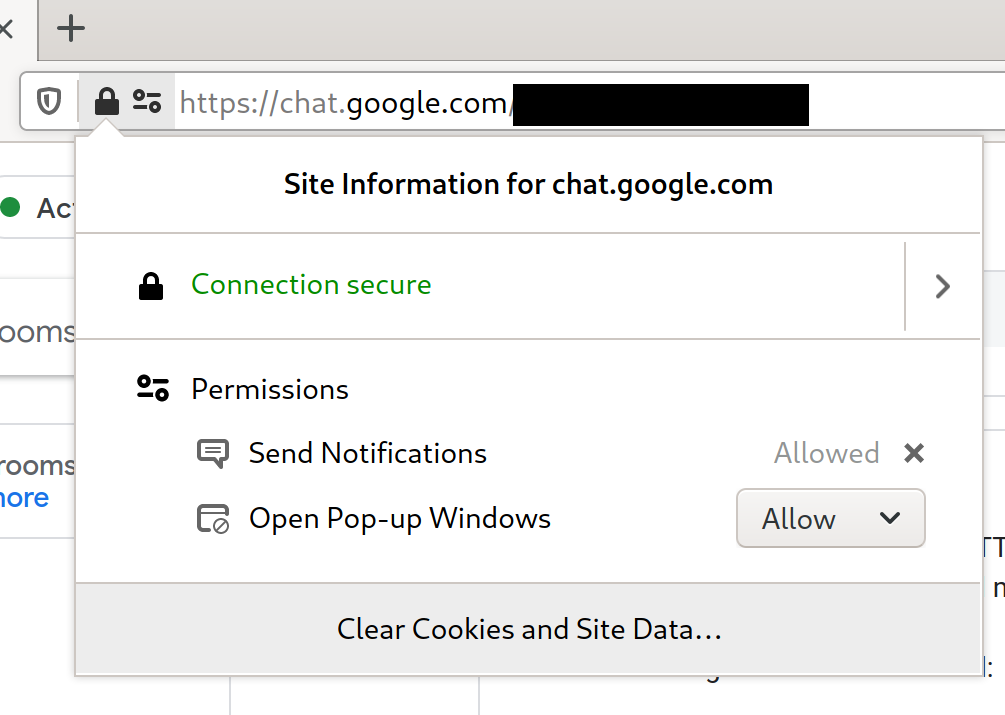
The way browsers handle user permissions e.g. “Send Notifications” or “Open Pop-up Windows” has potential. If permissions are set there’s an icon in the address bar that toggles a “Site information” widget that can be used to make settings. The same thing is also used to inform about the connection security status. Maybe, in the future, a native UA calibration tool could piggyback on that if a page uses calibration features.
Level 1
A CSS env(unit-scale-physical) property is the main goal. At the same
time, this is the hardest one to convince the CSS Working Group of; some
minds are already made up because similar attempts were made in the past
and because it would involve some effort on the browser vendor site.
One big contra argument always was that the calibration information would involve getting reliable information from the hardware, and that this can’t be done 100 % reliably all the time. As described in Level 0, we can lead the way and show how to do this with user calibration as a fallback. On the positive side, it’s not 100 % of devices either that can’t report reliable information. There are even projectors that can auto-focus nowadays.
UA/Browser support for env(unit-scale-physical) would improve the user
experience a lot, and make the usage of physical measurements feasible
for many more pages. Much less calibration would have to be performed,
it would work across pages, and also UAs could maybe also decide better if
a calibration must be invalidated and renewed, e.g. when the screen has
changed.
The calibration widget could act as a polyfill until UAs catch up.
Level 2
Media-query support would be incredibly useful. I’m not proposing how exactly these media-queries will have to look. With the experience coming from Level 0 and Level 1, we’ll be able to describe precisely what kind of media-queries are required. This would enable authors to improve cross-device interoperability a lot.
Level 3
A new CSS property unit-anchoring: physical|pixel|author, would be a logical consequence.
Technically it is already possible to anchor a document to physical measurements instead of the CSS-Reference-Pixel, but it is a bit complicated:
/* Applied on :root this will anchor the entire website to
 * physical units.
 */
.physical-unit-anchoring {
    /* Scale everything. */
    `transform: scale(env(unit-scale-physical))`;
    /* The visual default font-size of the user can be preserved. */
    font-size: calc(100% / env(unit-scale-physical));
    /* Reset page width to pre-transform size. */
    width: calc(100% / env(unit-scale-physical));
}
Note: on :root this works better than on any generic element,
especially because the transform size changes of the element are not
compensated well in this example, i.e. element height or margin in block
direction would need adaptions to fit the transformed element into the
document flow, but these adaptions differ on a case by case basis.
According to the CSS spec, a UA can already decide to anchor to physical measurements. This would add a way, from within CSS, to ask the UA to do a specific anchoring. Together with Level 2 media query support, it would be entirely possible to use this safely without having to compromise on interoperability or futureproofness.
Links
Please suggest more links via the discussions board.
Implementations
- this Article
- (nothing else here yet)
Further Reading
- Nick Sherman on A List Apart: Responsive Typography is a Physical Discipline, But Your Computer Doesn’t Know It (Yet)
- The infamous issue #614 on CSS-WG
Changelog
- initial version 2021-03-15
- fixed a rounding issue in CalibrationWidget #21 2021-12-01