Typography
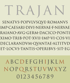
Typography is the art and technique of arranging type to make written language legible, readable and appealing when displayed. The arrangement of type involves selecting typefaces, point sizes, line lengths, line-spacing (leading), and letter-spacing (tracking), and adjusting the space between pairs of letters (kerning[1]). The term typography is also applied to the style, arrangement, and appearance of the letters, numbers, and symbols created by the process. Type design is a closely related craft, sometimes considered part of typography; most typographers do not design typefaces, and some type designers do not consider themselves typographers.[2][3] Typography also may be used as an ornamental and decorative device, unrelated to the communication of information.
Typography is the work of typesetters (also known as compositors), typographers, graphic designers, art directors, manga artists, comic book artists, graffiti artists, and, now, anyone who arranges words, letters, numbers, and symbols for publication, display, or distribution, from clerical workers and newsletter writers to anyone self-publishing materials. Until the Digital Age, typography was a specialized occupation. Digitization opened up typography to new generations of previously unrelated designers and lay users. As the capability to create typography has become ubiquitous, the application of principles and best practices developed over generations of skilled workers and professionals has diminished.[4][5] Thus, at a time when scientific techniques can provide evidence that supports established practice (legibility or brand recognition achieved through the appropriate use of serifs, letter case, letter forms, contrast, spacing, etc.) through understanding the limitations of human vision, typography may be encountered that fails to achieve its principal objective: effective communication.
Etymology[edit]
The word "typography" in English comes from the Greek roots τύπος typos ('impression') and -γραφία -graphia ('writing').
History[edit]
Although typically applied to printed, published, broadcast, and reproduced materials in contemporary times, all words, letters, symbols, and numbers written alongside the earliest naturalistic drawings by humans may be called typography. The word, typography, is derived from the Greek words τύπος typos "form" or "impression" and γράφειν graphein "to write", traces its origins to the first punches and dies used to make seals and currency in ancient times, which ties the concept to printing. The uneven spacing of the impressions on brick stamps found in the Mesopotamian cities of Uruk and Larsa, dating from the second millennium B.C., may be evidence of type, wherein the reuse of identical characters was applied to create cuneiform text.[6] Babylonian cylinder seals were used to create an impression on a surface by rolling the seal on wet clay.[7] Typography was also implemented in the Phaistos Disc, an enigmatic Minoan printed item from Crete, which dates to between 1850 and 1600 B.C.[8][9][10] It has been proposed that Roman lead pipe inscriptions were created with movable type printing,[11][12][13] but German typographer Herbert Brekle recently dismissed this view.[14]
The essential criterion of type identity was met by medieval print artifacts such as the Latin Pruefening Abbey inscription of 1119 that was created by the same technique as the Phaistos Disc.[8][15][16][17] The silver altarpiece of patriarch Pellegrinus II (1195–1204) in the cathedral of Cividale was printed with individual letter punches.[18][19][20] Apparently, the same printing technique may be found in tenth to twelfth century Byzantine reliquaries.[18][19] Other early examples include individual letter tiles where the words are formed by assembling single letter tiles in the desired order, which were reasonably widespread in medieval Northern Europe.[8][16]
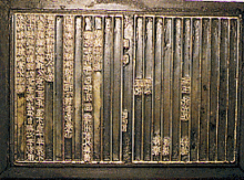
Typography with movable type was invented during the eleventh-century Song dynasty in China by Bi Sheng (990–1051).[21] His movable type system was manufactured from ceramic materials, and clay type printing continued to be practiced in China until the Qing Dynasty.
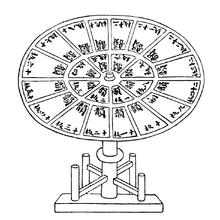
Wang Zhen was one of the pioneers of wooden movable type. Although the wooden type was more durable under the mechanical rigors of handling, repeated printing wore the character faces down and the types could be replaced only by carving new pieces.[22]
Metal movable type was first invented in Korea during the Goryeo Dynasty, approximately 1230. Hua Sui introduced bronze type printing to China in 1490 AD. The diffusion of both movable-type systems was limited and the technology did not spread beyond East and Central Asia, however.[23]
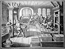
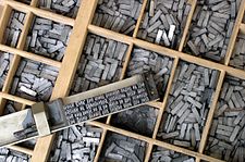
Modern lead-based movable type, along with the mechanical printing press, is most often attributed to the goldsmith Johannes Gutenberg in 1439.[24][25][26][27] His type pieces, made from a lead-based alloy, suited printing purposes so well that the alloy is still used today.[28] Gutenberg developed specialized techniques for casting and combining cheap copies of letter punches in the vast quantities required to print multiple copies of texts.[29] This technical breakthrough was instrumental in starting the Printing Revolution and the first book printed with lead-based movable type was the Gutenberg Bible.
Rapidly advancing technology revolutionized typography in the latter twentieth century. During the 1960s some camera-ready typesetting could be produced in any office or workshop with stand-alone machines such as those introduced by IBM (see: IBM Selectric typewriter). During the same period Letraset introduced Dry transfer technology that allowed designers to transfer types instantly.[30] The famous Lorem Ipsum gained popularity due to its usage in Letraset. During the mid-1980s personal computers such as the Macintosh allowed type designers to create typefaces digitally using commercial graphic design software. Digital technology also enabled designers to create more experimental typefaces as well as the practical typefaces of traditional typography. Designs for typefaces could be created faster with the new technology, and for more specific functions.[7] The cost for developing typefaces was drastically lowered, becoming widely available to the masses. The change has been called the "democratization of type" and has given new designers more opportunities to enter the field.[31]
Evolution[edit]
The design of typefaces has developed alongside the development of typesetting systems.[32] Although typography has evolved significantly from its origins, it is a largely conservative art that tends to cleave closely to tradition.[33] This is because legibility is paramount, and so the typefaces that are the most readable usually are retained. In addition, the evolution of typography is inextricably intertwined with lettering by hand and related art forms, especially formal styles, which thrived for centuries preceding typography,[33] and so the evolution of typography must be discussed with reference to this relationship.
In the nascent stages of European printing, the typeface (blackletter, or Gothic) was designed in imitation of the popular hand-lettering styles of scribes.[34] Initially, this typeface was difficult to read, because each letter was set in place individually and made to fit tightly into the allocated space.[35] The art of manuscript writing, whose origin was during Hellenistic and Roman bookmaking, reached its zenith in the illuminated manuscripts of the Middle Ages. Metal typefaces notably altered the style, making it "crisp and uncompromising", and also brought about "new standards of composition".[33] During the Renaissance period in France, Claude Garamond was partially responsible for the adoption of Roman typeface that eventually supplanted the more commonly used Gothic (blackletter).[36]:8 Roman typeface also was based on hand-lettering styles.[37]
The development of Roman typeface can be traced back to Greek lapidary letters. Greek lapidary letters were carved into stone and "one of the first formal uses of Western letterforms"; after that, Roman lapidary letterforms evolved into the monumental capitals, which laid the foundation for Western typographical design, especially serif typefaces.[36]:10 There are two styles of Roman typefaces: the old style, and the modern. The former is characterized by its similarly weighted lines, while the latter is distinguished by its contrast of light and heavy lines.[34] Often, these styles are combined.
By the twentieth century, computers turned typeface design into a rather simplified process. This has allowed the number of typefaces and styles to proliferate exponentially, as there now are thousands available.[34] Unfortunately, confusion between typeface and font (the various styles of a single typeface) occurred in 1984 when Steve Jobs mislabeled typefaces as fonts for Apple computers and his error has been perpetuated throughout the computer industry, leading to common misuse by the public of the term "font" when typeface is the proper term.[citation needed]
Experimental typeface uses[edit]
"Experimental typography" is defined as the unconventional and more artistic approach to typeface selection. Francis Picabia was a Dada pioneer of this practice in the early twentieth century. David Carson is often associated with this movement, particularly for his work in Ray Gun magazine in the 1990s. His work caused an uproar in the design community due to his abandonment of standard practices in typeface selection, layout, and design. Experimental typography is said to place emphasis on expressing emotion, rather than having a concern for legibility while communicating ideas, hence considered bordering on being art.
Techniques[edit]
There are many facets to the expressive use of typography, and with those come many different techniques to help with visual aid and the graphic design. Spacing and kerning, size-specific spacing, x-height and vertical proportions, character variation, width, weight, and contrast,[38] are several techniques that are necessary to be taken into consideration when thinking about the appropriateness of specific typefaces or creating them. When placing two or more differing and/or contrasting fonts together, these techniques come into play for organizational strategies and demanding attractive qualities. For example, if the bulk of a title has a more unfamiliar or unusual font, simpler sans-serif fonts will help complement the title while attracting more attention to the piece as a whole.[39]
Scope[edit]
In contemporary use, the practice and study of typography include a broad range, covering all aspects of letter design and application, both mechanical (typesetting, type design, and typefaces) and manual (handwriting and calligraphy). Typographical elements may appear in a wide variety of situations, including:
- Documents
- Presentations
- Display typography (described below)
- Clothing
- Maps and labels
- Vehicle instrument panels
- As a component of industrial design—type on household appliances, pens, and wristwatches, for example
- As a component in modern poetry (see, for example, the poetry of e. e. cummings)
Since digitization, typographical uses have spread to a wider range of applications, appearing on web pages, LCD mobile phone screens, and hand-held video games.
Recent research in psychology has studied the effects of typography on human cognition. The research points toward multiple applications such as helping readers remember the content better and strategically use fonts to help dyslexic readers.[40]
Text typefaces[edit]
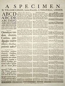
Traditionally, text is composed to create a readable, coherent, and visually satisfying typeface that works invisibly, without the awareness of the reader. Even distribution of typeset material, with a minimum of distractions and anomalies, aims to produce clarity and transparency.
Choice of typeface(s) is the primary aspect of text typography—prose fiction, non-fiction, editorial, educational, religious, scientific, spiritual, and commercial writing all have differing characteristics and requirements of appropriate typefaces (and their fonts or styles). For historic material, established text typefaces frequently are chosen according to a scheme of historical genre acquired by a long process of accretion, with considerable overlap among historical periods.
Contemporary books are more likely to be set with state-of-the-art "text romans" or "book romans" typefaces with serifs and design values echoing present-day design arts, which are closely based on traditional models such as those of Nicolas Jenson, Francesco Griffo (a punchcutter who created the model for Aldine typefaces), and Claude Garamond. With their more specialized requirements, newspapers and magazines rely on compact, tightly fitted styles of text typefaces with serifs specially designed for the task, which offer maximum flexibility, readability, legibility, and efficient use of page space. Sans serif text typefaces (without serifs) often are used for introductory paragraphs, incidental text, and whole short articles. A current fashion is to pair a sans-serif typeface for headings with a high-performance serif typeface of matching style for the text of an article.
Typesetting conventions are modulated by orthography and linguistics, word structures, word frequencies, morphology, phonetic constructs and linguistic syntax. Typesetting conventions also are subject to specific cultural conventions. For example, in French it is customary to insert a non-breaking space before a colon (:) or semicolon (;) in a sentence, while in English it is not.
Color[edit]
In typesetting, color is the overall density of the ink on the page, determined mainly by the typeface, but also by the word spacing, leading, and depth of the margins.[41] Text layout, tone, or color of the set text, and the interplay of text with the white space of the page in combination with other graphic elements impart a "feel" or "resonance" to the subject matter. With printed media, typographers also are concerned with binding margins, paper selection, and printing methods when determining the correct color of the page.
Principles of the typographic craft[edit]
Three fundamental aspects of typography are legibility, readability, and aesthetics. Although in a non-technical sense "legible" and "readable" are often used synonymously, typographically they are separate but related concepts.[42] Legibility and readability tend to support aesthetic aspects of a product.
Legibility describes how easily individual characters can be distinguished from one another. It is described by Walter Tracy as "the quality of being decipherable and recognisable".[42] For instance, if a "b" and an "h", or a "3" and an "8", are difficult to distinguish at small sizes, this is a problem of legibility.[42] Typographers are concerned with legibility insofar as it is their job to select the correct font to use. Brush Script is an example of a font containing many characters that might be difficult to distinguish. The selection of cases influences the legibility of typography because using only upper-case letters (all-caps) reduces legibility.
Readability refers to how easy it is to read the text as a whole, as opposed to the individual character recognition described by legibility. Use of margins, word- and line-spacing, and clear document structure all impact readability. Some fonts or font styles, for instance sans-serif fonts, are considered to have low readability and so be unsuited for large quantities of prose.[42]
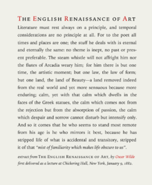
Legibility "refers to perception" (being able to see as determined by physical limitations of the eye), and readability "refers to comprehension" (understanding the meaning).[42] Good typographers and graphic designers aim to achieve excellence in both.
"The typeface chosen should be legible. That is, it should be read without effort. Sometimes legibility is simply a matter of type size; more often, however, it is a matter of typeface design. Case selection always influences legibility. In general, typefaces that are true to the basic letterforms are more legible than typefaces that have been condensed, expanded, embellished, or abstracted.
However, even a legible typeface can become unreadable through poor setting and placement, just as a less legible typeface can be made more readable through good design.[43]
Studies of both legibility and readability have examined a wide range of factors including type size and type design. For example, comparing serif vs. sans-serif type, roman type vs. oblique type, and italic type, line length, line spacing, color contrast, the design of right-hand edge (for example, justification, straight right hand edge) vs. ragged right, and whether text is hyphenated. Justified copy must be adjusted tightly during typesetting to prevent loss of readability, something beyond the capabilities of typical personal computers.
Legibility research has been published since the late nineteenth century. Although there often are commonalities and agreement on many topics, others often create poignant areas of conflict and variation of opinion. For example, Alex Poole asserts that no one has provided a conclusive answer as to which typeface style, serif or sans serif, provides the most legibility,[44][unreliable source?] although differences of opinion exist regarding such debates. Other topics such as justified vs unjustified type, use of hyphens, and proper typefaces for people with reading difficulties such as dyslexia, have continued to be subjects of debate.
Legibility is usually measured through the speed of reading, with comprehension scores used to check for effectiveness (that is, not a rushed or careless read). For example, Miles Tinker, who published numerous studies from the 1930s to the 1960s, used a speed of reading test that required participants to spot incongruous words as an effectiveness filter.
The Readability of Print Unit at the Royal College of Art under Professor Herbert Spencer with Brian Coe and Linda Reynolds[45] did important work in this area. It was one of the centres that revealed the importance of the saccadic rhythm of eye movement for readability—in particular, the ability to take in (i.e., recognise the meaning of groups of) about three words at once and the physiognomy of the eye, which means the eye tires if the line required more than 3 or 4 of these saccadic jumps. More than this is found to introduce strain and errors in reading (e.g., Doubling). The use of all-caps renders words indistinguishable as groups, all letters presenting a uniform line to the eye, requiring special effort for separation and understanding.
These days, legibility research tends to be limited to critical issues or the testing of specific design solutions (for example, when new typefaces are developed). Examples of critical issues include typefaces for people with visual impairment, typefaces and case selection for highway and street signs, or for other conditions where legibility may make a key difference.
Much of the legibility research literature is atheoretical—various factors were tested individually or in combination (inevitably so, as the different factors are interdependent), but many tests were carried out in the absence of a model of reading or visual perception. Some typographers believe that the overall word shape (Bouma) is essential in readability and that the theory of parallel letter recognition is either wrong, less important, or not the entire picture. Word shape differs by outline, influenced by ascending and descending elements of lower case letters and enables reading the entire word without having to parse out each letter (for example, dog is easily distinguished from cat) and that becomes more influential to being able to read groups of words at a time.
Studies distinguishing between Bouma recognition and parallel letter recognition with regard to how people recognize words when they read, have favored parallel letter recognition, which is widely accepted by cognitive psychologists.[citation needed]
Some commonly agreed findings of legibility research include:[citation needed]
- Text set in lower case is more legible than text set all in upper case (capitals, all-caps), presumably because lower case letter structures and word shapes are more distinctive.
- Extenders (ascenders, descenders, and other projecting parts) increase salience (prominence).
- Regular upright type (roman type) is found to be more legible than italic type.
- Contrast, without dazzling brightness, also has been found to be important, with black on yellow/cream being most effective along with white on blue.
- Positive images (e.g., black on white) make handheld material easier to read than negative or reversed (e.g., white on black). Even this commonly accepted practice has some exceptions, however (for example, in some cases of disability,[46][unreliable source?] and designing the most effective signs for drivers).
- The upper portions of letters (ascenders) play a stronger part in the recognition process than the lower portions.
This section does not cite any sources. (June 2016) (Learn how and when to remove this template message) |
The aesthetic concerns in typography deal not only with the careful selection of one or two harmonizing typefaces and relative type sizes but also with laying out elements to be printed on a flat surface tastefully and appealingly, among others. For this reason, typographers attempt to observe typographical principles, the most common of which are listed below:
- Limit up to three colors, which should harmonize to each other and with the color of the paper and the dominant color(s) of the photo or graphics
- Limit to two typefaces on a single page, which should "match"
- Limit up to three fonts and sizes
- Select the size of leading to be optimal and most pleasing to the eyes.
- The number of different enhancements such as greater size, bold, italic fonts, capitalization, or different typeface, different color, as used for headlines and emphasized words inside the text block, should be limited and consistent and be judiciously selected
- Avoid underlining like pest and should not be on top of another enhancement
- Text should be placed judiciously to lead the eye from one text cognitively natural way to the next text
- Multi-line headline should be segmented by phrases (no phrase should be split into two lines)
- No widows and orphans (no beginning line of paragraph at the bottom of page, no last line of paragraph at the top of page)
- Likewise no headline is at the page bottom
- The last line of a paragraph should flush with the preceding lines and not stand alone below a picture
- The printing elements should not be scattered in the hodgepodge fashion across the page unless it truly conveys hodgepodge.
- The letters V and W at the beginning of a paragraph line should extent a little to the left of the vertical left flush line to give an optical impression of being flush with lines below.
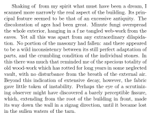
Readability also may be compromised by letter-spacing, word spacing, or leading that is too tight or too loose. It may be improved when generous vertical space separates text lines, making it easier for the eye to distinguish one line from the next, or previous line. Poorly designed typefaces and those that are too tightly or loosely fitted also may result in poor legibility. Underlining also may reduce readability by eliminating the recognition effect contributed by the descending elements of letters.
Periodical publications, especially newspapers and magazines, use typographical elements to achieve an attractive, distinctive appearance, to aid readers in navigating the publication, and in some cases for dramatic effect. By formulating a style guide, a publication or periodical standardizes with a relatively small collection of typefaces, each used for specific elements within the publication, and makes consistent use of typefaces, case, type sizes, italic, boldface, colors, and other typographic features such as combining large and small capital letters together. Some publications, such as The Guardian and The Economist, go so far as to commission a type designer to create customized typefaces for their exclusive use.
Different periodical publications design their publications, including their typography, to achieve a particular tone or style. For example, USA Today uses a bold, colorful, and comparatively modern style through their use of a variety of typefaces and colors; type sizes vary widely, and the newspaper's name is placed on a colored background. In contrast, The New York Times uses a more traditional approach, with fewer colors, less typeface variation, and more columns.
Especially on the front page of newspapers and on magazine covers, headlines often are set in larger display typefaces to attract attention, and are placed near the masthead.
Typography utilized to characterize text: Typography is intended to reveal the character of the text. Through the use of typography, a body of text can instantaneously reveal the mood the author intends to convey to its readers. The message that a body of text conveys has a direct relationship with the typeface that is chosen. Therefore, when a person focuses on typography and setting type, they must pay very close attention to the typeface they decide to choose. Choosing the correct typeface for a body of text can only be done after thoroughly reading the text, understanding its context, and understanding what the text is wishing to convey. Once the typographer has an understanding of the text, then they have the responsibility of using the appropriate typeface to honor the writing done by the author of the text. Knowledge of choosing the correct typeface comes along with understanding the historical background of typefaces and understanding the reason why that typeface was created. For example, if the body of the text is titled “Commercial Real Estate Transactions” and further elaborates on the real estate market throughout the body, then the appropriate typeface to use in this instance is a serif typeface. This typeface would be appropriate because the author intends to inform its audience on a serious topic and not entertain his audience with an anecdote; therefore, a serif typeface would effectively convey a sense of seriousness to the audience instantaneously. The typographer would also employ larger-sized font for the title of the text to convey a sense of importance to the title of the text which directly informs the reader of the structure in which the text is intended to be read, as well as increasing readability from varying viewing distances.[47]
Typography utilized to make reading practical: Typography not only has a direct correlation with honoring the tone of the text but also shares the responsibility of making the audience commence the reading process as well as sustaining the audience's attention throughout the body of the text. Although typography can potentially be utilized to attract the reader's attention to commence the reading process and create a beautiful/attractive piece of text, the craft of typography is not limited to aesthetics. Typography is a craft that is not stringently encompassed with the aesthetic appeal of the text. On the contrary, the object of typography is to make the reading experience practical and useful. The use of bold colors, multiple typefaces, and colorful backgrounds in a typographic design may be eye-catching; however, it may not be appropriate for all bodies of text and could potentially make text illegible. Overuse of design elements such as colors and typefaces can create an unsettling reading experience, preventing the author of the text from conveying their message to readers.[48]
Display graphics[edit]
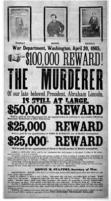
Type may be combined with negative space and images, forming relationships and dialog between the words and images for special effects. Display designs are a potent element in graphic design. Some sign designers exhibit less concern for readability, sacrificing it for an artistic manner. Color and size of type elements may be much more prevalent than in solely text designs. Most display items exploit type at larger sizes, where the details of letter design are magnified. Color is used for its emotional effect in conveying the tone and nature of subject matter.
Display typography encompasses:
- Advertisements in publications, such as newspapers and magazines
- Magazine and newspaper headline type
- Signs and other large-scale-letter designs, such as information signs and billboards
- Posters
- Brochures and flyers
- Packaging and labeling
- Business communications and advertising
- Book covers
- Typographic logos, trademarks, and word marks
- Graffiti
- Inscriptions
- Architectural lettering
- Kinetic typography in motion pictures, television, vending machine displays, online, and computer screen displays
Advertising[edit]
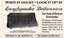
Typography has long been a vital part of promotional material and advertising. Designers often use typefaces to set a theme and mood in an advertisement (for example, using bold, large text to convey a particular message to the reader).[49] Choice of typeface is often used to draw attention to a particular advertisement, combined with efficient use of color, shapes, and images.[50] Today, typography in advertising often reflects a company's brand.
A brand may use typography to express its theme, personality, and message.[51] Just by looking at the typeface, viewers can get an idea about the message and personality of the brand, which the brands are fully aware of and are tapping into the power of good typography.
Typefaces used in advertisements convey different messages to the reader: classical ones are for a strong personality, while more modern ones may convey clean, neutral look. Bold typefaces are used for making statements and attracting attention. In any design, a balance has to be achieved between the visual impact and communication aspects.[52] Digital technology in the twentieth and twenty-first centuries has enabled the creation of typefaces for advertising that are more experimental than traditional typefaces.[31]
Inscriptional and architectural lettering[edit]
The history of inscriptional lettering is intimately tied to the history of writing, the evolution of letterforms and the craft of the hand. The widespread use of the computer and various etching and sandblasting techniques today has made the hand carved monument a rarity, and the number of letter-carvers left in the US continues to dwindle.
For monumental lettering to be effective, it must be considered carefully in its context. Proportions of letters need to be altered as their size and distance from the viewer increases. An expert monument designer gains understanding of these nuances through much practice and observation of the craft. Letters drawn by hand and for a specific project have the possibility of being richly specific and profoundly beautiful in the hand of a master. Each also may take up to an hour to carve, so it is no wonder that the automated sandblasting process has become the industry standard.[53]
To create a sandblasted letter, a rubber mat is laser-cut from a computer file and glued to the stone. The blasted sand then bites a coarse groove or channel into the exposed surface. Unfortunately, many of the computer applications that create these files and interface with the laser cutter do not have a wide selection of many typefaces, and often have inferior versions of those typefaces that are available. What now can be done in minutes, however, lacks the striking architecture and geometry of the chisel-cut letter that allows light to play across its distinct interior planes.[54]
See also[edit]
- Allography, different representations of the same grapheme or character in different typefaces have the same meaning
- Letterpress printing
- Punctuation
- Typographic alignment
- Category:Typographical symbols
Supporting organizations[edit]
- ATypI: Association Typographique Internationale ("International Typographic Association")
- International Society of Typographic Designers
- Society of Typographic Aficionados
- Type Directors Club
References[edit]
Citations[edit]
- ^ Bringhurst, Robert. The Elements of Typographic Style, version 3.1. Canada: Hartley & Marks, 2005. p. 32.
- ^ Pipes, Alan (1997), Production For Graphic Designers (2nd ed.), Prentice-Hall
- ^ Berry, John D. (16 August 2004). "dot-font: Being a Typographer". CreativePro. Creative Publishing Network and CreativePro. Retrieved 7 April 2015.
- ^ Koch, Beth E (2012). "Emotion in Typographic Design: An Empirical Examination". Visible Language. 46 (3): 208–227.
- ^ Walker, Sue (2014) [2001]. Typography and language in everyday life: Prescriptions and practices. London, New York: Routledge. ISBN 9780582357556.
- ^ Sass, Benjamin; Marzahn, Joachim (2010). Aramaic and Figural Stamp Impressions on Bricks of the Sixth Century B.C. from Babylon. Harrassowitz Verlag. pp. 11, 20, 160. ISBN 978-3-447-06184-1.
"the latter has cuneiform signs that look as if made with a movable type, and impressions from Assur display the same phenomenon
- ^ a b Clair, Kate; Busic-Snyder, Cynthia (2012). A Typographic Workbook: A Primer to History, Techniques, and Artistry. John Wiley & Sons. pp. 4, 123. ISBN 978-1-118-39988-0.
- ^ a b c Brekle, Herbert E (1997), "Das typographische Prinzip. Versuch einer Begriffsklärung", Gutenberg-Jahrbuch (in German), 72: 58–63, archived from the original on 16 July 2011
- ^ Schwartz, Benjamin (1959), "The Phaistos disk", Journal of Near Eastern Studies, 18 (2): 105–12, doi:10.1086/371517, S2CID 162272726
- ^ Diamond, Jared, "13: Necessity's Mother: The evolution of technology", Guns, Germs, and Steel: The Fates of Human Society, ISBN 978-0-393-03891-0
- ^ Lanciani, R (1975) [Classe di Scienze Morali, Rom 1881], "Topografia di Roma antica. I commentarii di Frontino intorno le acque e gli acquedotti. Silloge epigrafica aquaria" [Topography of ancient Rome. The commentaries of Frontini around the waters and the aqueducts], Memorie della Reale Accademia dei Lincei, III (in Italian), Quasar, IV: 215–616
- ^ Pace, Pietrantonio (1986), Gli acquedotti di Roma e il Aquaeductu di Frontino [The aqueducts of Rome and the aqueduct of Frontino] (in Italian) (2nd ed.), Rome: Art Studio S. Eligio
- ^ Hodge, A. Trevor (1992), Roman Aqueducts & Water Supply, London: Duckworth, ISBN 978-0-7156-2194-3
- ^ ——— (2010), "Herstellungstechniken von Inschriften auf römischen Wasserleitungsrohren aus Blei", in Hanneforth, Thomas; Fanselow, Gisbert (eds.), Language and Logos. Studies in Theoretical and Computational Linguistics, Studia grammatica, 72, Berlin: Akademie Verlag, pp. 419–37, ISBN 978-3-05-004931-1
- ^ ——— (2005), Die Prüfeninger Weihinschrift von 1119. Eine paläographisch-typographische Untersuchung (brief summary) (in German), Regensburg: Scriptorium Verlag für Kultur und Wissenschaft, ISBN 978-3-937527-06-2
- ^ a b Lehmann-Haupt, Hellmut (1940), "Englische Holzstempelalphabete des XIII. Jahrhunderts", Gutenberg-Jahrbuch (in German): 93–97
- ^ Hupp, Otto (1906), "Die Prüfeninger Weiheinschrift von 1119", Studien aus Kunst und Geschichte, Festschrift für Friedrich Schneider (in German), Freiburg i. Br.: Herder
- ^ a b Lipinsky, Angelo (1986), "La pala argentea del Patriarca Pellegrino nella Collegiata di Cividale e le sue iscrizioni con caratteri mobili", Ateneo Veneto (in Italian), 24: 75–80
- ^ a b Koch, Walter (1994), Literaturbericht zur mittelalterlichen und neuzeitlichen Epigraphik (1985–1991), Monumenta Germaniae Historica: Hilfsmittel (in German), 14, München, p. 213, ISBN 978-3-88612-114-4
- ^ ——— (2011), Die typographische Herstellungstechnik der Inschriften auf dem silbernen Altaraufsatz im Dom von Cividale (PDF) (in German), DE: Regensburg
- ^ Needham, Joseph (1994). The Shorter Science and Civilisation in China, Volume 4. Cambridge University Press. p. 14. ISBN 978-0-521-32995-8.
Bi Sheng... who first devised, about 1045, the art of printing with movable type
- ^ Tsien, Tsuen-Hsuin (1985). Paper and Printing. Needham, Joseph Science and Civilization in China:. vol. 5 part 1. Cambridge University Press. pp. 201–217. ISBN 978-0-521-08690-5.
- ^ Ch'on 1993, p. 19.
- ^ McLuhan, Marshall (1962), The Gutenberg Galaxy: The Making of Typographic Man (1st ed.), University of Toronto Press, ISBN 978-0-8020-6041-9
- ^ Eisenstein, Elizabeth L (1980), The Printing Press as an Agent of Change, Cambridge University Press, ISBN 978-0-521-29955-8
- ^ Febvre, Lucien; Martin, Henri-Jean (1997), The Coming of the Book: The Impact of Printing 1450–1800, London: Verso, ISBN 978-1-85984-108-2
- ^ Man, John (2002), The Gutenberg Revolution: The Story of a Genius and an Invention that Changed the World, London: Headline Review, ISBN 978-0-7472-4504-9
- ^ "Printing", Encyclopædia Britannica, 2006.
- ^ Dowding, Geoffrey. An Introduction to the History of Printing Types. London: Oak Knoll Press, 1998. p. 3.
- ^ https://www.lipsum.com
- ^ a b Rothenberg, Randall (23 July 1990). "Computers Change the Face of Type". New York Times.
- ^ Carter, Rob; Day, Ben; Meggs, Philip B. (2012). Typographic Design: Form and Communication. p. 125.
It is the earliest mechanization of a handicraft: the handlettering of books. Typographic design has been closely bound to the evolution of technology, for the capabilities and limitations of typesetting systems have posed constraints upon the design process.
- ^ a b c "Typography". Credo Reference/The Crystal Reference Encyclopedia. Credo Reference. Retrieved 2 November 2014.
- ^ a b c "Type". Credo Reference/The Columbia Encyclopedia. Credo Reference. Retrieved 2 November 2014.
- ^ "The Evolution of Typography" (PDF). Infoamerica. Retrieved 2 November 2014.
- ^ a b Haley, Allan (2012). Typography, Referenced. Beverly, MA: Rockport Publishers. ISBN 978-1-59253-702-0.
- ^ Roman type
- ^ "On Legibility – In Typography And Type Design | Learn – Scannerlicker!". learn.scannerlicker.net. Retrieved 5 November 2015.
- ^ "Expressive Web Typography: Useful Examples and Techniques – Smashing Magazine". Smashing Magazine. 13 September 2010. Retrieved 5 November 2015.
- ^ "Font Psychology: New research & practical insights". Cognition Today. 28 May 2018. Retrieved 2 January 2019.
- ^ Eckersley, Richard (1994), "Color", Glossary of Typesetting Terms, Chicago guides to writing, editing and publishing, University of Chicago Press, ISBN 978-0-226-18371-8, OCLC 316234150
- ^ a b c d e Tracy, Walter (1986), Letters of Credit, Gordon Fraser
- ^ Craig, J; Scala, IK (2006), Designing with Type, the Essential Guide to Typography (5th ed.), Watson Guptil
- ^ Poole, Alex, Which Are More Legible: Serif or Sans Serif Typefaces?, archived from the original on 6 March 2010, retrieved 27 November 2016
- ^ Reynolds, Linda (1988), "Legibility of Type", Baseline, vol. 10
- ^ Writing clearly, UK: National Literacy Trust, archived from the original on 11 April 2009, retrieved 11 May 2009
- ^ "Typography: Often invisible, always essential | Insights | Larsen". Larsen. Retrieved 4 February 2016.
- ^ "What Is Typography? | The Importance of Typography in Web Design". Bop Design. 8 July 2013. Retrieved 4 February 2016.
- ^ Stanley, Thomas Blaine. The Technique of Advertising Production. New York: Prentice-Hall, 1940. p. 40.
- ^ Stanley, Thomas Blaine. The Technique of Advertising Production. New York: Prentice-Hall, 1940.
- ^ "Brand Typography: A Complete Guide".
- ^ Glaser, C. Knight, J. When Typography Speaks Louder Than Words. 13 April 2012.
- ^ "Typography". History of Graphic Design. Retrieved 24 October 2017.
- ^ "Typogrphy: Inscriptional and architectural lettering". My self and my world. Retrieved 24 October 2017.
General sources[edit]
- Bringhurst, Robert (2004), The Elements of Typographic Style (3rd ed.), Point Roberts, WA: Hartley & Marks, ISBN 978-0-88179-133-4.
- Standard Test Method of Comparative Legibility by Means of Polarizing Filter Instrumentation, ASTM International, D7298
- Ch'on, Hye-bong (1993), "Typography in Korea", Koreana, 7 (2): 10–19.
- Gill, Eric (2000) [1931], An Essay on Typography, Boston: David R Godine, p. 188, ISBN 978-0-87923-950-3
- Dowding, Geoffrey. Finer Points in the Spacing and Arrangement of the Printed Word, 2nd ed. Point Roberts, WA: Hartley and Marks, 1999.
- Heller, Steven; Meggs, Philip B (2001), Texts on Type: Critical Writings on Typography, New York: Allworth Press, ISBN 978-1-58115-082-7. A compilation of more than fifty texts on the history, practice, and aesthetics of typeface design and typography
- Jury, David (2004), About Face: Reviving the Rules of Typography, Mies, Switzerland: Rotovision, ISBN 978-2-88046-798-2, 159 pp.
- Lawson, Alexander (1990), Anatomy of a Typeface, ISBN 978-0-87923-333-4, devotes entire chapters to the development and uses of individual or small groupings of typefaces
- Martínez de Sousa, José (2007), Manual de estilo de la lengua española [Style manual of the Spanish language] (in Spanish) (3rd ed.), Gijón: Trea.
- ——— (2008), Ortografía y ortotipografía del español actual [Orthography and orthotypography of current Spanish] (in Spanish) (2nd ed.), Gijón: Trea.
- McLean, Ruari. The Thames and Hudson Manual of Typography. New York: Thames and Hudson, 1992.
- Mestres, Josep M; Costa, Joan; Oliva, Mireia; Fité, Ricard (2009), Manual d'estil. La redacció i l'edició de textos [Style manual. The redaction & edition of texts] (in Catalan) (4th rev. i ampl. ed.), Vic/Barcelona: Eumo/UB/UPF/Rosa Sensat.
- Papazian, Hrant H (2000), "Improving the Tool", in Swanson, Gunnar (ed.), Graphic Design and Reading: explorations of an uneasy relationship, New York: Allworth Press, ISBN 978-1-58115-063-6.
- Pujol, JM; i Solà, Joan (2000), Ortotipografia. Manual de l'author, l'autoeditor i el dissenyador gràfic [Orthotypography. Manual of the authors, the self-editor and the graphic designer] (in Catalan) (2nd rev ed.), Barcelona: Columna.
- Swanson, Gunnar (2000), Graphic Design and Reading: explorations of an uneasy relationship, New York: Allworth Press, ISBN 978-1-58115-063-6.
- Tschichold, Jan (1991), The Form of the Book: Essays on the Morality of Good Design, Vancouver: Hartley & Marks, ISBN 978-0-88179-034-4. A comprehensive collection of essays on the typographic art. A more classic companion to Bringhurst 2002.
- Tschichold, Jan. The New Typography. New ed. Berkeley: University of California Press, 2006.
- Warde, Beatrice (2000), "The Crystal Goblet, or Printing Should Be Invisible", in Swanson, Gunnar (ed.), Graphic Design and Reading: explorations of an uneasy relationship, New York: Allworth Press, ISBN 978-1-58115-063-6.
- White, Alex W (1999), Type in Use – Effective typography for electronic publishing (2.0 ed.), New York: W. W. Norton & Company, ISBN 978-0-393-73034-0.
- Lexique des règles typographiques en usage à l'Imprimerie nationale [Lexic of the typographic rules used at the National press] (in French), Imprimerie nationale, 2002, ISBN 978-2-7433-0482-9.
- Type Foundries of America and Their Catalogues ISBN 9781884718069 and A Typographical Journey through the Inland Printer, 1883-1900 ISBN 9780916526047 by Maurice Annenberg[1]
External links[edit]
| Wikimedia Commons has media related to Typography. |
| Look up typography in Wiktionary, the free dictionary. |
- AIGA typography – Articles and interviews relating to typography from AIGA's Voice section
- Decode Unicode – A wiki with all 98,884 Unicode characters, including full text search capability
- Layout & typography – W3C Internationalization (i18n) Activity
- . Encyclopædia Britannica (11th ed.). 1911. pp. 509–548.
- ^ "Collection: Maurice Annenberg papers | Archival Collections". archives.lib.umd.edu. Retrieved 10 August 2020.
