Space the initial frontier
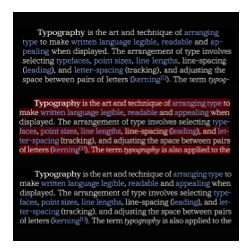
Typography can contain a lot of different elements, beyond text and space, like symbols, icons rules ornaments and effects seen in shadows, blurs and motion. But for the most part, it contains just the marks of glyphs and the spaces within and around them. While fonts contain all of the glyphs, they also contain some of the space, both inside of and around the glyphs, while composition supplies the space around the type and between lines of text that are not part of the font.
One thing is for certain, most of the fonts we use today, contain mostly space. So here the spaces will be dissected, described, exemplified and examined for their role, the interplay of their roles and how some of the roles change with the addition of variable fonts It is in variable fonts that both the glyphs and spaces of a font can be as fluid as the sizing, line spacing and tracking are in application programs and the markup languages they employ to describe pages.
If I type something, (anything actually), you are seeing a series of shapes in various combinations hanging onto a framework of rectangles.
The largest key on the keyboard is the space key. Typography starts with its parent space, the “imaginary” em square, into rectangles of the same height as the em square representing the default widths of each glyph in a font, including the space. These rectangles are only “defaults”, as the space between lines, between glyphs, and the word space, can be changed by the user, and then by the final display of font in print or screen.
Square one, where all type begins
This is a rectangle of equal sides and angles, making it a square.
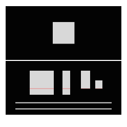
The em square.
In type, this square represents to the type designer two things that are important links to the reader. Vertically, the space represents the intersection between lines of text when the font is composed without additional space between lines.
The vertical dimensions of a font’s main glyph groups.
Second, chosing where the baseline is in the em square, is how the font line up with every other font of any size or style. This gives the type designer the extents that can be allotted above and below the baseline, for the typeface family.
And so the type designer plans the vertical metrics and horizonatal of all the characters of a typeface, based on how the designer wants collections of glyphs to be glimpsed, seen, viewed, skimmed, read, or read for a long time.
Length of text / various ways to “see” it.
Horizontally, the height is the same as the em in each glyph and except when the script and design are monospaced, each glyph has an appropriate width. In such fonts, the horizontal dimension represents the default spacing of as the glyphs space best with all the other characters in the font.
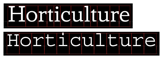
Glyphs of different widths. Monospaced all one width.
(So far, this is true of all scripts, and all designs)
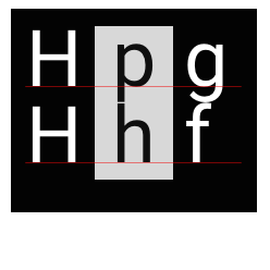
Add direction of reading, at the behest of whichever direction, or directions, a language allows, and the square has direction. For example, and to zero in on one language at a time, all the types of Latin are designed for all the languages that use Latin, to be read in lines from top to bottom, with each line being read from left to right. So the square has a beginning on the top and left sides, and has ends at the bottom and the right side.
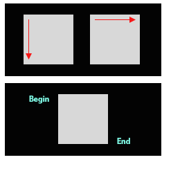
Beginnings and ends of transparencies.
The em square (realized in physical form as an em quad in metal type), can be seen typographically as a space with beginnings and ends, and nothing in the midst of that, at the size of the type with no additional spacing around it. The other spaces affecting the appearance of our square between the lines, is line spacing, and/or between the letters is letter spacing. Besides reading following from the beginning to end of each glyph, when programs responding to type specifications are told to add line spacing or letterspacing, they do so to the end, i.e. the bottom and right sides of glyphs.
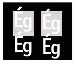
Line Spacing and letter drawing Latin typefaces
Between the lines is called line spacing, in CSS, and is valued either by the size of the space or as a percentage of the size of the type. Between the letters are default letter spacing and kerning, with tracking being a function for changes to both, also usually expressed as a percentage of size. Letterspacing is obviously added at the end of each letter, and line spacing was traditionally, and today in most design applications, added to the bottom of each line. This was done to facilitate cooperative use of the em square and leading, between users and font developers in the use of languages with and without diacritic accents above the uppercase.
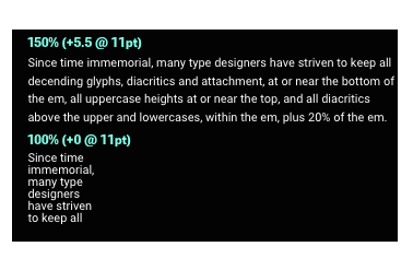
Since time immemorial, many type designers have striven to keep all decending glyphs, diacritics and attachment, at or near the bottom of the em, all uppercase heights at or near the top, and all diacritics above the upper and lowercases, within the em, plus 20% of the em. This defacto standard allows the user to align the type on the uppercase at the top of their text container, and either the baseline for all-cap use, or the bottom of the em for mixed case use, allowing any diacritics in the first line to “float” above the rest, with interline diacritics clear of the descenders in the line above.
Traditional (left) vs. CSS (right) line space addition.
Perhaps with a broader world view, CSS splits additional line spacing to place half above the em, and half below. this has the effect of starting the first line slightly lower than in traditional typography, but otherwise, on fonts made the traditional way, the behavior is the same from there to the bottom line, which of course, is slightly lower than in traditional type.
Line spacing at 120% of the size was a de facto standard for print, based on an “ideal” line length of somewhere between 60 and 75 characters, for long, sometimes called immersive reading. The size of type considered in that standard was between 9 and 11 points, with exceptions for smaller books, (going down to 8pt), and for younger readers, (going up to 12pt). For web typopgraphy, the practice of line spacing has increased significantly with the need to conserve paper removed.
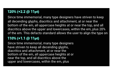
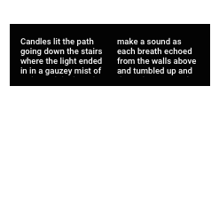
Traditional 120% in a 65 character column, and 110% in a 40 character column.
Showing type now that’s sized for print, for the illustration of column width issues, and more will come on type sizes in web use, The line spacing of text in immersive reading of 65-character, 9-11 pt type with 120% line spacing “standard”, comes along with gradually decreasing line spacing % as the column shrinks in width. In addition to length of text and column width playing roles in line spacing, prerequisite to this kind of reading is a style selection of a normal or regular weight and width, from a typeface family likely to be familiar to the reader.
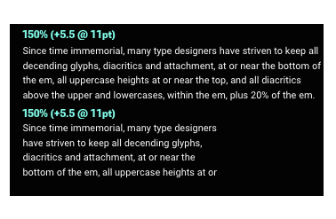
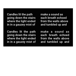
Web use commonly shows 150% line spacing in both column widths.
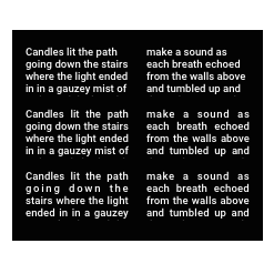
Leaving the effects of styles beyond a regular weight and width until later column width/character count, size and case, (as Latin composition of all caps and mixed case usually occupy different vertical metrics). At the default of 65 characters you see here, if I smash a line’s Collin width down to the width of the widest word in the line, regardless of what size it is, I don’t need extra line spacing, 100% is fine. All caps in narrow columns can be linespaced at 90-80% in English use and almost to 75% in some cases of narrow columns at large sizes.
65 character column line spaced for web use above. column shrunk to widest word and additional linespacing removed.
As size ranges up, it is almost certainly the result of the length of text getting shorter, leaving the range of immersive reading and entering the realm of a shorter attention span from the reader. So between the poles of 1 character per column and 65, and a size range from 9 to 144, line spacing for mixed case ranges from 100-120% of size, with collision avoidance of descenders and ascenders being a limiting factor. All caps line spacing usually ranges from 80-95%, with presence of uppercase descenders, like “Q” or J providing a possible limitation.
Uppercase line spacing relies on a baseline to cap height metrics, and can be zero or less depending on size.
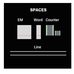
The Word Space, an important nothing
The most important character to reading in a font is the space glyph, or word space. In Latin use, its width is derived from a formula, based on the width of one of the letters, or simply chosen visually by the type designer. It is often adjusted by applications, but its fundamental task is to make certain it’s the largest horizontal space in text. Readers can’t be confused by the spaces between letters, between letters and punctuation or between punctuation and punctuation, and the word space. While this sounds obvious, it rarely is an issue with Latin type because so much work in the development of typefaces used by the public goes into elimintating any space that can compete, visually, with the word space.
Word space and its adjustment.
The word space’s second most critical appearance is to remain around or be smaller than the line space, i.e. the space between lines. Obviously the word space is less important and sometimes absent entirely from type that’s glimpsed, seen, or quickly viewed, and is increasingly important as the text is to be skimmed, read, or read for a long time. In the most complex case, justification of narrow columns, the word space’s range of widths needs to be kept narrow relative linespacing, which for narrow columns can be quite small.
The type designer’s task, then, is to create a default word space and letter spacing, that work over a range of sizes, column widths, with hyphenation and justification a distinct possibilty. Included in that, beyond the default letterspacing, is the type designer’s task of making kerning pairs, in essence a list of exceptions to the default letter spacing that need to be prevented from being too far apart, like /T/o, thus competing with the size of the word space.
Default letter spacing and Kerning vs word space.
Counter space in letterforms
There’s only one other kind of space left in type and it’s inside the letters. This may be fully enclosed, like /o’s interior, trapped along the baseline and cap height, like /K, or swirling amidst the stem of the /S, but it’s what gives a typeface the start on all the other spaces we’ve covered.

Counters.
The user has three kinds of control over this space. Type size, applied to a single style of type, makes them grow and shrink linearly to the change of size. Changing to the use of different styles within a regular font family alters the internal white spaces according to the style change from one to the next. Variation font technology, which can provide both of the above, can also provide optical sizes that adjust the internal white spaces over a range of sizes, as well as adding fluid ranges of weight and width axes.

Counter changes via size, style and opsz.
And while typefaces overwhelmingly end with well defined spaces, between words, letters and exceptional pairs, and many typeface families include a blizzard of styles, each with unique spacing, the way the font format, composition software, like design applications and web browsers operate, Latin typography faces challenges to the type user. And where there is a challenge in Latin, there’s likely to be more elsewhere in the world of scripts.
Variable fonts and all the spaces
The Opentype 1.8 specification and its successors do not include variations on the em square size, or on the location of the baseline. Nevertheless, variable height and depth of glyphs, can change the relationship of glyphs to the height and depth of the em.
Changing the height of uppercase, lowercase and the extenders of Latin all have the same basic utility of changing the heights without effecting the widths or horizontal spacing of text, a handy option in placing type in buttons, in shortening the descenders to reduce line space in headlines. These vertical variations can also be used to change the height of Latin, to better compose with glyphs or text from other languages contained in a fallback font.
Vertical changes to cap height and descend depth.
Letter spacing can be changed using a variable axis, and was brought up as a possibility several years ago. It should be useful eventually, but in Latin proportional typefaces, variable spacing is problematic as it brings along the need for variation of all the spacing exceptions, the kerning pairs. These exceptions as stored in the font format today, would increase the development, processing and file size of a font family, perhaps exponentially.
There may also be other issues with a spacing axis, aside from file size and complexity, related to what I call “latent kerning” and wonder about that in the link provided. But one reason tracking and line spacing are useful to begin with, is they affect an isolated parameter. And though the effects of varying that parameter differ from glyph to glyph, (e.g. lowercase o is less susceptible to the effects of line spacing than lowercase p), as long as the type user knows it, they can react ahead of the reader and keep the line space or letter space from being too tight or loose.
When the idea of independent control of line spacing and letter spacing is joined by the possibilities of a width axis, or an axis that just controls the contents (or both together in a variable font), several other classes of typographic refinements also become possible. One example is with headlines, sub-heads and other sizes above the body size, that are typically shorter in length, but often not short enough for the wide variety of portals the typography may be appearing in.
Using a width axis to fit headlines.
Whether because careful editorial is too costly, or using multiple widths of a typeface family was too expensive or time-consuming to download, the more common solution is adding lots of space for and around the headline along with an often draconian editorial limit on the character count. A variable font with a width axis can be automated to a great extent to alleviate this. But the weight axis of a typeface family typically changes more than one thing at once.
In a weight axis the spacing is tightened and the weights lightened from those of regular, as the typeface is condensed. This maintains the same appearance of regular weight in narrower styles. The opposite happens when a typeface gets wider. So with an axis that just controls the counter, or the space inside the letters, what we label XTRA, changing the width, while maintaining the spacing weights and everything else, would not mix well with regular, as it would appear a different weight from the regular. This is especially true if the XTRA axis were used at the same range as the width axis.
But if XTRA is used in conjunction with control over the word space and letter spacing values, all used as little as possible to fit lines to a column, the typographer can improve hyphenation, prevent excessively large word spaces, and also justify less than absolutely. The latter meaning I can choose a range of %, like 97% line length, within which to justify.
Demonstrating this has involved research on how each browser calculates each line, both it’s length and where it breaks, a forward-looking algorithm that considers the next line and the last line of text, development of ranges of adjustability for word space, letter space and XTRA over the range of sizes from 8 to 144, and a UI for testing and output marking lines with color to indicate the change in width.
using XTRA, tracking and word space control to justify text 98%.
A variable hyphen feature, line layout of languages with different direction word structure and word-length tendencies in the world’s script use, are ripe for current and future exploration.
Takeaways:
Various variable spaces.